Accelerated Colouring Techniques
-------------------------------------------------------------------------------------------------------------------------
By Captain Slug
+=IMPORTANT=+
1. This guide was written for Paint Shop Pro 5 but will apply to Newer versions.
I do not use the newer version because they have several features that slow
me down and generally annoy me. This guide will work with Photoshop, but
you'll need to use Alpha channel layers or "Select Color Range" instead of
Masks. I don't use Photoshop anymore because the it's a huge pain to use
either of those methods when PSP5 can do it in two simple steps.
2. I highlighy recommend that you save your images as uncompressed .psp files
as you work and once you've finished. Doing this will save you alot of time
and will allow you to both start where you left off, or edit mistakes you
hadn't noticed until after the fact.
3. Photoshop does not impliment Masks. So if you save an image containing
masks as a .psd, you will lose that information in the file. Before saving
the image as a .psd make sure to SAVE ALL YOUR MASKS as Alpha channels. It
took me a while to figure that out and prevented me from doing any colouring
at my school's computer lab where they only use PhotoShop.
4. Why do I sometimes spell color with a U? It can be spelled either way,
but to avoid confusion i feel that it works best to deliniate when the word
is being used as a verb, or a noun. When used as a verb in this guide it
will be spelled C-O-L-O-U-R. When used as a noun, I'll spell it C-O-L-O-R.
Why? I don't know either, but it helps me organize my thoughts (and Colourist
looks alot better on a business card than Colorist does)
What this guide covers.
------------------------
This isn't a very long or complicated guide. It's a simple step-by-step eye
opening lesson in how to use Masks, Layers, and the standard brush to colour
even the most complicated images. With some practice you'll be colouring
and shading your own line art (or a friends) in an hour or two.
What this guide does NOT cover.
-------------------------------
Since it came naturally to me through lots and lots of 3D modelling work,
this guide will NOT be covering shading techniques, light behaviors on different
surfaces, or any other artistic tidbits which you can find in most books
relative to standard painting. If you need help understanding color, composition,
perspective, or the nature of light, visit the library. I made this guide
because I've talked to so many people who are having a hard time colouring
images efficiently enough that they can avoid getting angry at the software's
complexity. Here we go...
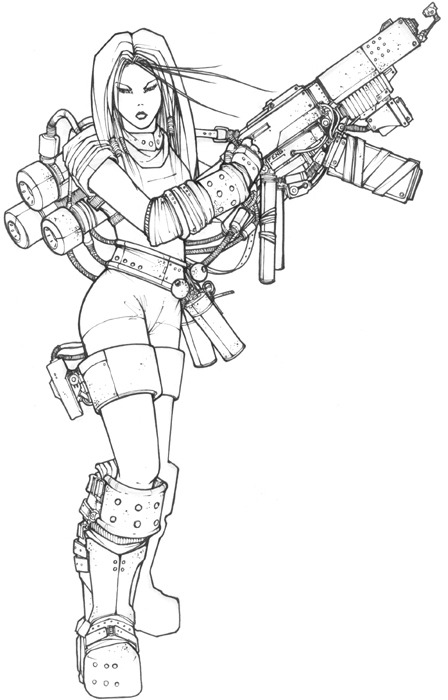
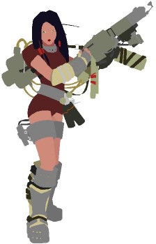
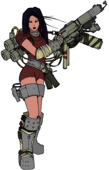
Image being coloured in this guide
-------------------------------
The image used in this tutorial was originally drawn by Feng Zhu, a professional
conceptual artist whom I admire greatly. I was unable to get ahold of him
to ask his permission to colour this image, but I couldn't resist using it
since it's such an attractive colouring source that I had been meaning to
work on for quite some time. You can view more of his work at
http://www.artbyfeng.com
Linework Preperation
Since you'll need linework that's as black as possible it's best to ink the
image before scanning it. Clean artwork will save you the hassle of doing
on the computer. While I have grown accustomed to doing it on the computer,
most artists have not. If you have the equipment and skill to ink your drawings,
I highly recommend it. YOu have two options for prepping you linework for
colouring.
a) Darkening inked linework that was over-exposed or washed-out
by your scanner
1. Duplicate Layer (right click in layer panel)
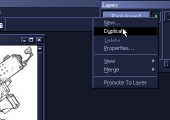
2. Set Layer Blend Mode to Multiply
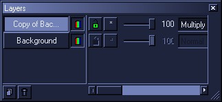
3. Merge all layers (Flatten)

Tip: This same method can be used to fixed over-exposed digital photos. If
you want to fix under-exposed images use "Screen" as your Layer blend mode.
b) Relining a pencil sketch manually
1. Make a new layer on-top.
2. Select any colour (Green, Red, purple, it doesn't matter).
3. use the Bezier and straight line tools to trace over every line in the
image.
3a. If you want multicolour outlines I recommend making a new layer for each
colour outline you plan on using.
4. create a new layer, fill it with white, and move it underneath all of
the other layers.
5. Shift the brightness\contrast (Shift+B) of your Traced layer so that all
the new lines are black.
6. Once you have the image completely traced, hide all the layers except
the WHITE layer and the Traced layer.
7. Merge those layers (temporarily) to copy and paste that as a new image.
8. Reduce to Greyscale and save as a .GIF
9. go back to Trace layer image and hit undo. Repeat steps 5-8 for the other
color outline layers if you made any.
10. now you have a set of Masks that you can use to build an extremely clean,
outlined piece of artwork.
Here's and example of coloured outlines as seen in an image I coloured for
Josh Routt (Amuck50)
Colouring setup
----------------------------------
Mask
1. Create new mask from image (This window) Source Luminance + Invert Mask
Data
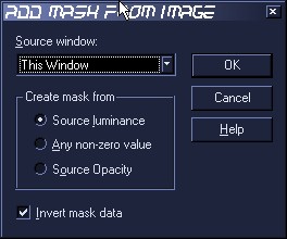
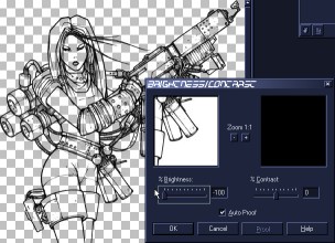
2. Adjust Brightness\Contrast (Shift + B) [Brightness= -100 CONTRAST= 0]
Tip: If for some reason you need to edit the mask (add more lines or erase/soften
edges), select the linework layer and press (CTRL+K) or select EDIT from
the mask menu. If you want to add lines use the brush or line tools using
WHITE. A mask is essentially a transparency mask. That means WHITE = 100%
opacity BLACK = 0% opacity
To exit Mask editing mode simply uncheck EDIT on the Mask menu or press (CTRL+K
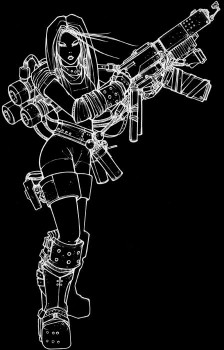
again). If you were to copy the mask layer it would look like this.
Tip: Another benefit to using masks is that it allows you to edit the color
of the linework. You can select the line work layer and use the brush of
fill tools to recolor all the lines, or just a small area. Chrome or reflective
objects look best with grey or white outlines, and masks allow you to add
such details with minimal effort.
Selection layer (optional)
A selection layer can ease the process of creating your solid colors layer
IF your image is not overly detailed, shaded, or thinly outlined. Instead
of having to lasso each different color area, you can simply use the magix
wand in the selection layer to select a cavity. Then expand the selection
1 or 2 pixels, switch to the solid colour layer, and fill in the selection.
Here's how to make a selection layer.
1. Select mask editing mode (CTRL + K)
2. Copy and paste as new image
3. Adjust Brightness\Contrast [Brightness= 0 CONTRAST= 100]

4. Copy
5. Go back to working image
6. Create new "selection" layer then drag it underneath the Linework MASK
layer
7. Paste 2-color selection into this layer (CTRL+A, CTRL+SHIFT+L)
8. this layer does not need to be visible so set the opacity to 0
Solid color layer
1. Create a new "solid color" layer
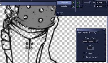
2. You can make the slection areas for the solid color layer with either
the point-to-point lasso tool, or the magic wand (in the selection layer).
DO NOT use antialias. Otherwise it will be harder to go back later and select
a color you want to shade.
3. Fill in your solid colors on this layer
Different layer blend modes
- Before you start shading you'll need to decide what layer blend mode will
give you the look closest to the type of light source you want to emulate
in your shading. Here are the differnt types best suited for highlights and
shadows.
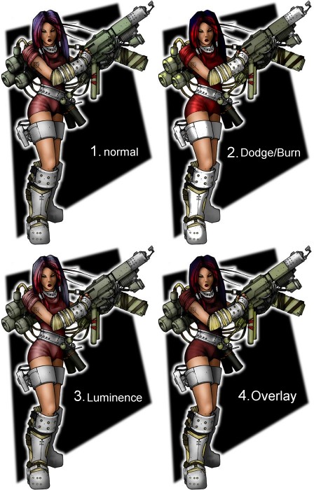
1. Of all the blending modes, this type takes the longest since you have
to pick a color for the highlights and shadows. This however gives you more
control over the color of the light sources, and more flexability in editing
your results later.
2. For high contrast lighting simply change the layer blend modes to Dodge
(Highlights) or Burn Shadows applications. With this blending method you
can shade with different shades of grey ((Grey or Black for Burn, White or
Gray for Dodge)). The further toward either end of the scale, the more intense
the applied shading will be. The effect is relative to the brightness of
the color you're shading, so white or black objects cannot be burned or dodged.
This means you will need to use near-values (not-quite white, or near-black)
in you solid color layer. Dodge and burn require more practice than the other
blend modes.
3. For soft transitions and speed (high ambient light) use Luminence Layer
blending. Shades lighter than the underneath colour will create highlights.
Shades darker will make shadows. The further away they are from the source
color, the more severe the shading. The advantage of this mixing method is
that you don't have to select an actual colour range. So you could select
white and black, and do both the highlights and shadows on the same layer
without switching colours or moving to another layer.
4. For washed out colours you can use the OVERLAY blend mode. I don't use
it very often since it's noticably weak. This would be good for a scene with
alot of diffused light sources.
Shading
1. add different shading layers for different treatments. Skin and hair should
generally remain seperate from the other shading layers because they react
differently to light sources.
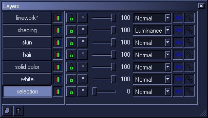
The white layer is just a background layer filled with white.
Tip: Since you're working with layers you can
always go back and change layer mixing methods if you change your mind or
add more light sources or scene elements. Or you can simply duplicate a layer
to double it's intensity.
2. select the solid color layer
3. use the magic wand to select a color object you want to shade
4. select the shading layer you want to use for that object
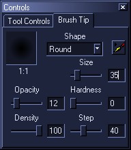
5. Use the "Soft" brush in any size to brush in highlights or shadows (depending
on the layer)
Tip: Since your shading is on a layer seperate from your solid colors, it's
easy to undo anything with the eraser tool. Simply set it to the same peramenters
as the soft brush. The eraser can also be used to further soften shading
transitions.
End
That's all there is to it. Backgrounds are obviously a completely different
story. One which I will unfortunately not be writing about since they involve
techniques I have yet to master. I had to develop all of these methods
independantly since there were no guides that emphasized efficiency rather
than using excessive effort. I now have atleast 5 years of colouring and
texturing practice under my belt and hopefully this guide will allow a few
people to skip the trial and error process I had to go through to get as
good as I am.